Creating a calm and inviting atmosphere in your home starts with the colors you choose. Whether you’re repainting a room or selecting new decor, calm colors can help foster relaxation and reduce stress. If you want your home to feel like a peaceful retreat, choosing the right shades is essential.
In this post, we’ll explore practical tips for selecting calm colors that suit your space and personal style. From understanding color psychology to exploring popular calming hues, you’ll learn how to bring tranquility into your home through color.
Why Choose Calm Colors?
Colors have a strong impact on our mood and emotions. Bright, intense shades can energize us, while softer, muted tones tend to promote relaxation. Using calm colors in your home can:
– Reduce anxiety and stress
– Create a soothing environment for rest and rejuvenation
– Make smaller spaces feel more open and airy
– Support better sleep in bedrooms
– Enhance focus in work or study areas
When you want your home to feel like a sanctuary, calm colors are a great foundation.
Understanding Calm Colors and Their Effects
Calm colors are generally soft, muted, or cool-toned. They tend to be less saturated and visually “quiet.” Here are some common calm color categories and their effects:
Blues
Shades of blue are often linked to peace and serenity. Light blues remind us of the sky and water, helping to calm the mind. They’re great choices for bedrooms, bathrooms, and living rooms.
Greens
Green is associated with nature and balance. Softer greens can refresh and soothe the senses, creating a harmonious space.
Neutrals
Neutral tones like beige, taupe, and soft grays provide a warm, grounding effect. They work well as a base color for any room and pair easily with different accent shades.
Pastels
Soft pastel colors, such as lavender, blush pink, or pale yellow, can add gentle color without overwhelming the senses.
Tips for Choosing the Right Calm Colors
Selecting calm colors for your home involves more than just picking your favorite shade. Consider these tips to find the perfect hues:
1. Consider the Room’s Purpose
Think about how you use each room. Bedrooms and bathrooms benefit from soothing blues and greens, which encourage relaxation. Living rooms may combine neutrals with soft pastels to create a welcoming yet calm atmosphere. Home offices might lean toward cool grays or muted greens that support focus without feeling sterile.
2. Test Samples in Different Lighting
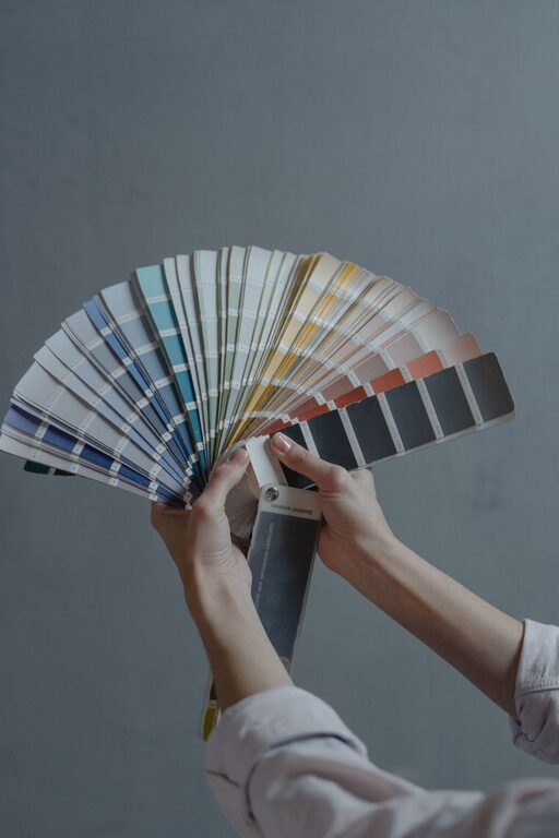
Colors look different depending on natural and artificial light. Always test paint samples on your walls and observe them at different times of day. This helps you see how the shades change and ensures they maintain a calming effect in your space.
3. Use Color Psychology as a Guide
Color psychology can help you choose hues that encourage calmness. For example, blues lower heart rate and reduce anxiety, while greens promote balance and renewal. Use these insights to narrow your options.
4. Start with a Neutral Base
If you’re unsure about committing to color, start with a neutral palette. Soft whites, warm beiges, and light grays provide a calming backdrop and allow you to add gentle accents later.
5. Incorporate Calm Color Accents
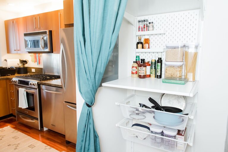
Beyond paint, bring in calm colors through furnishings, textiles, and accessories. Throw pillows, curtains, rugs, and artwork are perfect for introducing subtle shades without overwhelming the space.
6. Balance Warm and Cool Tones
Too much cool color can feel cold, while too many warm tones might be overstimulating. Aim to balance these tones for a harmonious, peaceful feel. For instance, pair a soft blue wall with warm beige furniture.
7. Keep It Simple
Simple, uncluttered spaces with calm colors help reduce visual noise and create a peaceful aura. Avoid overly bold or busy patterns that can detract from the calming vibe.
Popular Calm Color Palettes for Inspiration
Here are some tried-and-true calm color combinations you might consider for your home:
– Soft Blue and Cream: Light blue walls paired with creamy off-white trim and furnishings create an airy, peaceful space.
– Sage Green and Warm Gray: This combo blends nature-inspired green with soft gray for a balanced and soothing room.
– Lavender and Pale Taupe: Gentle lavender accents with taupe walls add understated color and warmth.
– Muted Aqua and White: Aqua provides a refreshing, tranquil feel when combined with crisp white for contrast.
– Blush Pink and Light Beige: Soft blush tones add warmth and calmness, especially when balanced with neutral beige.
Final Thoughts
Choosing calm colors for your home is a wonderful way to create spaces that nurture relaxation and well-being. By understanding color effects, testing samples, and selecting harmonious shades, you can transform your rooms into serene retreats.
Remember to consider each room’s purpose and lighting, keep your palette simple, and incorporate calm accents. With these tips, you’ll find the perfect calm colors that reflect your style while promoting peace and comfort.
Enjoy creating a calm and beautiful home!
About the Author